레이이웃 구성
- css 도움받기 : pico.css
https://picocss.com/docs - children 컴포넌트 타입

레이아웃 컴포넌트 설정
Layout.tsx
import Footer from "../common/Footer";
import Header from "../common/Header";

interface LayoutProps {
    children: React.ReactNode;  // 리액트로 만든 모든 컴포넌트들 선얼할 수 있다.
}

function Layout({children} : LayoutProps ){
    return (
        <>
        <Header />
        <main>
            {children}
        </main>
        <Footer />
        </>
    )
}

export default Layout;
App.tsx
  return (
    <BookStoreThemeProvider>
      <ThemeSwitcher />
      <Layout>
        <Home />
      </Layout>
    </BookStoreThemeProvider>
  )
글로벌 스타일과 스타일드컴포넌트
global style
- global = 프로젝트 전체에 적용 = 프로젝트에 일관된 스타일링 적용
- user agent stylesheet로 표시되는 브라우저의 기본 스타일이 차이를 만든다.
- 브라우저 간의 스타일 차이를 극복하기 위해 사용
1) 에릭마이어 reset css : 모든 엘리먼트를 0으로 리셋
2) normalize.css : 브라우저와 기기간 차이 줄이는 데 사용
3) sanitize.css : 브라우저와 기기간 차이 줄이는 데 사용. selector 사용. 개선된 버전
- npm install sanitize.css --save (패키지에도 저장)
- index.tsx에 import 하기 : 프로젝트 전체 적용됨
- where selector 적용됨. 엘리먼트의 중복사용 줄임
styled component
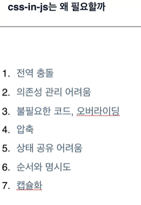
- css-in-js는 왜 필요할까
- 캡슐화가 가장 중요
- 관심사의 분리
2025.11.18 - [프레임워크\라이브러리/CSS] - [라이브러리] Vanilla Extract란?
[라이브러리] Vanilla Extract란?
Vanilla Extract란?Zero-runtime CSS in JS 라이브러리. CSS-in-JS는 말 그대로 "JavaScript 안에서 CSS를 작성하는 방식"이다.즉, 스타일을 별도의 CSS 파일이 아니라 JavaScript 코드 안에서 작성하는 것.대표적인 CSS-
thinktank911.tistory.com
- 설치 : npm install styled-components --save
- header 적용 : 난수화된 class 적용됨
import { styled } from "styled-components";

function Header(){
    return (
        <HeaderStyle>
            <h1>book store</h1>
        </HeaderStyle>
    )
}

const HeaderStyle = styled.header`
    background-color: #333;

    h1 {
        color: white;
    }
`;

export default Header;
global style 적용
- index.tsx에 적용했던 sanitize.css를 src/style/global.ts에 적용
- createGlobalStyle 모듈로 GlobalStyle 컴포넌트 생성
- index.tsx에 을 컴포넌트 위에 설정
- GlobalStyle 안에 프로젝트 고유의 스타일 적용할 수 있다.
테마 만들기
- ui, ux 일관성 유지
- 유지보수가 용이
- 확장성
- 재사용성
- 사용자 정의
style-components 테마 구성
theme provider로 각 theme 불러올 수 있다.

style-components 테마 적용하기
테마 만들기
    export const light: Theme = {
    name: 'light',
    color: {
    primary: 'brown',
    background: 'lightgray',
    secondary: 'blue',
    third: 'green',
    },
    };

    export const dark: Theme = {
    name: 'dark',
    color: {
    primary: 'coral',
    background: 'midnightblue',
    secondary: 'darkblue',
    third: 'darkgreen',
    },
    };
테마도 타입으로 관리
// 테마도 타입으로 관리
type ThemeName = 'light' | 'dark';

export interface Theme {
    name: ThemeName;
    color: {
        primary: string;
        background: string;
    };
}
여러 컬러가 추가될 때 대비 타입 추가 방법
- 컬러 키를 고정해주고 싶을 때 ColorKey 지정해줌
type ThemeName = 'light' | 'dark';
type ColorKey = 'primary' | 'background' | 'secondary' | 'third';

// 테마도 타입으로 관리
export interface Theme {
    name: ThemeName;
    color: {
        // 여러 컬러 추가될 때 대비 타입 추가 방법
        [key: string]: string;
        [key in ColorKey]: string;
    };
}
Record 사용
- Record Type은 Record <Key, Type> 형식으로 키가 Key이고 값이 Type인 객체 타입
- Record Type은 속성을 제한하고 싶은 경우 문자열 리터럴을 사용하여 Key에 허용 가능한 값을 제한
type ThemeName = 'light' | 'dark';
type ColorKey = 'primary' | 'background' | 'secondary' | 'third';

// 테마도 타입으로 관리
export interface Theme {
name: ThemeName;
color: Record<ColorKey, string>;
}
ThemeProvider 로 테마 적용
- index.tsx에 있던 GlobalStyle을 App.tsx로 옮김
- App 전체 요소를 'styled-components' 모듈의 <ThemeProvider>로 감싸고 theme를 props로 넘기기 (dark/light)
import { GlobalStyle } from './style/global';
import { ThemeProvider } from 'styled-components';
import { dark, light } from './style/theme';

function App() {
  return (
    <ThemeProvider theme={dark}>
      {/* <Layout children={<Home />}/> */}
      <GlobalStyle />
      <Layout>
        <Home />
      </Layout>
    </ThemeProvider>
  )
}
테마 적용 확인
- Header.tsx의 스타일을 theme에서 가져와서 적용한다.
const HeaderStyle = styled.header\`
background-color: ${({theme}) => theme.color.background};

h1 {
    color: ${({theme}) => theme.color.primary};
}
[이슈]
ERROR in src/components/common/Header.tsx:12:44 TS2339: Property 'color' does not exist on type 'DefaultTheme'. 10 | 11 | const HeaderStyle = styled.header > 12 | background-color: ${({theme}) => theme.color.background} | ^^^^^ 13 | 14 | h1 { 15 | color: ${({theme}) => theme.color.primary};
- 문제발생 : theme.color가 DefaultTheme에 존재하지 않아 스타일 적용이 안됨
- 원인파악 : TypeScript는 런타임 값과 타입을 분리해서 관리함.
styled-components는 테마를 타입 확장해야 하는데,
그걸 안 하면 TS는 기본적으로 DefaultTheme = {} 로 인식함 → theme.color 없음 → 오류.
styled-components가 사용하는 DefaultTheme 타입과 연결이 안 되어 있어서 생기는 오류.
즉, 내가 만든 Theme 타입이 TS에선 존재하지만,
styled-components는 여전히 자기가 가진 빈 DefaultTheme만 보고 있기 때문 - 해결방안 : styled-components의 DefaultTheme 확장
styled.d.ts 파일을 만들어서 DefaultTheme을 내가 만든 Theme 타입으로 확장
styled.d.ts
import 'styled-components';
import type { Theme } from './theme';

declare module 'styled-components' {
export interface DefaultTheme extends Theme {}
}
[이슈2]
- 문제발생 : 에러는 사라졌는데 스타일 적용 안됨
- 원인파악 : CSS 안에서 세미콜론이 하나라도 빠지면 적용 안 됨. HeaderStyle에 ;이 빠져 있었다.
- 해결 : 세미콜론(;) 넣어주니 해결
global style에도 테마 적용
- global.ts에 Props 적용
- GlobalStyle 컴포넌트에서 props로 넘겨준 themeName을 분기처리해서 color 지정
- theme.ts의 themeName type export하여 타입가드 지켜줌
import { createGlobalStyle } from 'styled-components';
import 'sanitize.css';
import { ThemeName } from './theme';

interface Props {
    themeName: ThemeName;
}

export const GlobalStyle = createGlobalStyle<Props>`
  body {
    padding: 0;
    margin: 0;
  }

  h1 {
    margin: 0;
  }

  * {
    color: ${(props) => (props.themeName === 'light' ?
        'black' : 'white')};
  }
`;
테마스위처 context API
- 사용자는 토글 UI를 통해 웹사이트의 색상 테마를 바꿀 수 있다.
- 색상 테마는 전역상태로 존재
- 사용자가 선택한 테마는 로컬스토리지에 저장
테마스위처 UI 버튼
src/components/header/ThemeSwitcher.tsx
import { ThemeName } from "../../style/theme";

interface Props {
    themeName : ThemeName;
    setThemeName : (themeName : ThemeName) => void;
}

function ThemeSwitcher({themeName, setThemeName}: Props) {

    const toggleTheme = () => {
        setThemeName(themeName === "light" ? "dark" : "light");
    }

    return (
        <button onClick={toggleTheme}>{themeName}</button>
    )
}

export default ThemeSwitcher;
임시로 App.tsx에 적용
const [themeName, setThemeName] = useState<ThemeName>('light');

  return (
    <ThemeProvider theme={light}>
      {/* <Layout children={<Home />}/> */}
      <GlobalStyle themeName={themeName} />
      <ThemeSwitcher themeName={themeName} setThemeName={setThemeName} />
      <Layout>
토글 기능 동작
- theme.ts에서 getTheme() 선언 후 리턴
// 테마 내보내기
export const getTheme = (themeName: ThemeName): Theme => {
    switch (themeName) {
        case 'light':
            return light;
        case 'dark':
            return dark;
        default:
            return light;
    }
};- App.tsx 에 ThemeProvider props에 getTheme 적용
<ThemeProvider theme={getTheme(themeName)}>
    <GlobalStyle themeName={themeName} />
    {children}
</ThemeProvider>
배경색 바꾸기
- GlobalStyle에서 body background-color 조건문 분기처리
export const GlobalStyle = createGlobalStyle<Props>`
  body {
    padding: 0;
    margin: 0;
    background-color: ${(props) => (props.themeName === 'light' ?
        'white' : 'black')};
 }
context API 적용
지역상태를 하위 컴포넌트 어디에서도 쓸 수 있도록 하기 위함이다.
- ThemeContext.tsx 만들기 (src>context>ThemeContext.tsx)
- ts아닌 tsx로 한 이유
- 추후 provider를 만들어서 이쪽으로 이동시킬 예정
import React, { createContext } from "react";
import { ThemeName } from "../style/theme";

interface State {
    themeName: ThemeName;
    setThemeName: (themeName: ThemeName) => void;
}

export const state = {
    themeName: "light" as ThemeName,
    setThemeName: (themeName: ThemeName) => {
        state.themeName = themeName;
    },

}

export const ThemeContext = createContext<State>(state);- App.tsx에 useContext 적용
// 지역상태 -> 전역상태 변경
  // const [themeName, setThemeName] = useState<ThemeName>('light');
const {themeName, setThemeName} = useContext(ThemeContext);- ThemeContext.tsx에 BookStoreThemeProvider 선언
export const BookStoreThemeProvider = ({children}: {
    children: React.ReactNode }) => {
        return (
            <ThemeContext.Provider value={state}>
                {children}
            </ThemeContext.Provider>
        )
    }
- App.tsx에 감싸기
return (
    <BookStoreThemeProvider>
      <ThemeProvider theme={getTheme(themeName)}>
          {/* <Layout children={<Home />}/> */}
          <GlobalStyle themeName={themeName} />
          <ThemeSwitcher themeName={themeName} setThemeName={setThemeName} />
          <Layout>
            <Home />
          </Layout>
       </ThemeProvider>
    </BookStoreThemeProvider>
)- BookStoreThemeProvider 내부에 useState 훅, toggleName, themProvider, GlobalStyle 이동
export const BookStoreThemeProvider = ({children}: {
    children: React.ReactNode }) => {
        const [themeName, setThemeName] = useState<ThemeName>('light');

        const toggleTheme = () => {
            setThemeName(themeName === "light" ? "dark" : "light");
        };

        return (
            <ThemeContext.Provider value={{themeName,
                toggleTheme
            }}>
                <ThemeProvider theme={getTheme(themeName)}>
                    <GlobalStyle themeName={themeName} />
                    {children}
                </ThemeProvider>
            </ThemeContext.Provider>
        )
}- App.tsx에서 나머지 지우기
function App() {

  // 지역상태 -> 전역상태 변경
  // const [themeName, setThemeName] = useState<ThemeName>('light');
  // const {themeName, setThemeName} = useContext(ThemeContext);

  return (
    <BookStoreThemeProvider>
      {/* <ThemeSwitcher themeName={themeName} setThemeName={setThemeName} /> */}
      <Layout>
        <Home />
      </Layout>
    </BookStoreThemeProvider>
  )
}
ThemeSwitcher도 context 구독하기
    import { useContext } from "react";
    import { ThemeName } from "../../style/theme";
    import { ThemeContext } from "../../context/ThemeContext";

    // interface Props {
    // themeName : ThemeName;
    // setThemeName : (themeName : ThemeName) => void;
    // }

    function ThemeSwitcher() {
    const {themeName, toggleTheme} = useContext(ThemeContext);

    // const toggleTheme = () => {
    //     setThemeName(themeName === "light" ? "dark" : "light");
    // }

    return (
        <button onClick={toggleTheme}>{themeName}</button>
    )

    }

    export default ThemeSwitcher;
[이슈]
- 문제발생 : 이때, onClick에 에러 발생
- 원인파악 : 넘겨주는 toggleTheme에 파라메터 지정되어 있어서
- 해결 : ThemeContext.tsx 의 state 의 toggleTheme 파라메터 제거한다.
  interface State {
  themeName: ThemeName;
  // toggleTheme: (themeName: ThemeName) => void;
  toggleTheme: () => void;
  }

  export const state = {
  themeName: "light" as ThemeName,
  // toggleTheme: (themeName: ThemeName) => {},
  toggleTheme: () => {}, // 파라메터 제거

  }
전역상태 로컬 스토리지 저장
- toggleTheme 시 localStorage에 테마 저장
- useEffect 훅 사용해서 localStorage에 저장된 THEME_LOCALSTORAGE_KEY 값을 셋팅
// ThemeContext.tsx
const toggleTheme = () => {
            setThemeName(themeName === "light" ? "dark" : "light");
            localStorage.setItem(THEME_LOCALSTORAGE_KEY,
                themeName === "light" ? "dark" : "light");
        };

        useEffect(() => {
            const savedThemeName = localStorage.getItem(THEME_LOCALSTORAGE_KEY) as ThemeName;
            setThemeName(savedThemeName || DEFAULT_THEME_NAME);
          }, []);
정리
- context는 일종의 Wrapper
- provider 하위의 컴포넌트들이 이를 구독하고 언제든지 꺼내 쓸 수 있다.
- 꺼내 쓰는 방법은 useContext 훅 이용
'프로젝트 > BookStore 사이트' 카테고리의 다른 글
| 1128 도서 상세 페이지 구현 (0) | 2025.11.28 |
|---|---|
| 1127 비밀번호 초기화, 도서 목록 페이지 구현 (0) | 2025.11.27 |
| 1126 라우트, 회원가입 (0) | 2025.11.26 |
| 1125 기본 컴포넌트 작성 및 테스트 - Title, Button, InputText, 헤더 푸터 (0) | 2025.11.25 |
| 1121 book store 프로젝트 시작 (0) | 2025.11.21 |